
Dashboards that force a decision
Why a first screen with fewer charts often shortens the argument in a product review.
Bangkok studio · Product telemetry
Dataeventbase teaches product teams how to design app analytics canvases: event grammar, metric trees, and the weekly review surface that actually changes what ships next.
From the floor
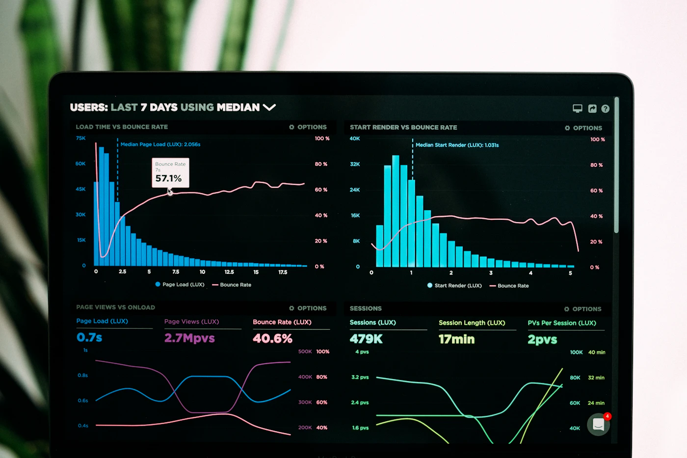
During Signal Architecture, a Bangkok marketplace team renamed their north-star panel after a two-hour inventory of what leadership actually argued about. The new canvas did not add charts. It removed five. Retention still lived on page two — but the first screen now answered whether a rider finished the job they opened the app to do.
Flagship

The programme we built for PMs and product analysts who already query events, but whose dashboards still collapse in a stakeholder room. You leave with a decision inventory, an event contract, and a live canvas — not a slide deck about “best practices.”
Modules cover metric trees without vanity branches, cohort reading without theatre, and a critique lab that is intentionally uncomfortable.
What we insist on
If the room cannot say what would change if the number moved, the panel does not earn space. We start every studio with a written inventory of decisions, not a warehouse tour.
Verbs, objects, and properties drift the moment marketing renames a funnel. We teach contracts that survive a rebrand and still read in SQL six months later.
Empty dashboards look “executive.” Crowded ones that answer the actual argument look professional. We compose canvases the way an editor composes a page.
A weekly review is not a paging system. Mixing them trains teams to ignore both. The studio splits the two and keeps them split.
From people who sat the room
“The metric tree module made our activation panel smaller. We dropped three vanity rates and kept the one our growth lead actually uses in hiring conversations.”
Useful, though the Thursday critiques run long if your instrumentation is still messy. Come with a working events table or you will spend week two apologising to the room.
★★★★☆ · “Event grammar” is the piece I still quote in standups. The canvas templates are opinionated — which is the point.
The room
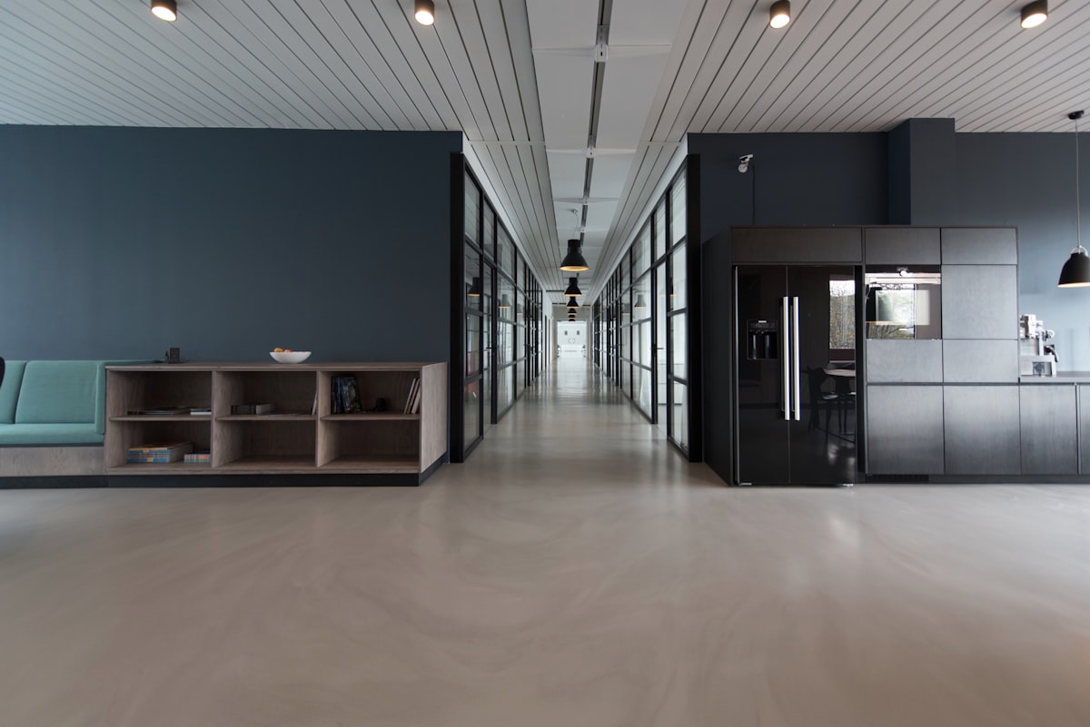
Live cohorts sit at 7 Ratchadaphisek. Recordings exist for teams who cannot travel, but the critique lab is built for people in the same air. Instructors are former PMs and analytics leads from Southeast Asian consumer products — not touring keynote talent.
If you want the method without a cohort date, read Telemetry Canvas, our public sketch of how we compose a product dashboard.
Field notes
Why a first screen with fewer charts often shortens the argument in a product review.

A naming contract for verbs and objects when marketing will rename the funnel anyway.
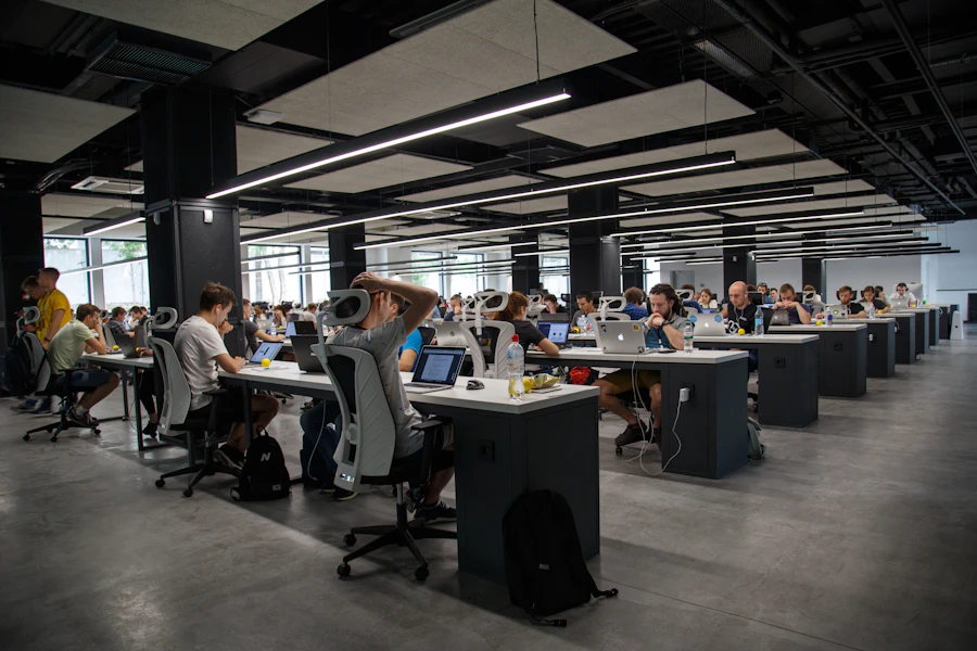
A 50-minute weekly cadence that keeps PMs honest without inventing a new meeting religion.
Enquire
Tell us the product, the stack, and whether you need a seat or a private desk. We reply within two working days.